JupySQL Plotting with DuckDB
TL;DR: JupySQL provides a seamless SQL experience in Jupyter and uses DuckDB to visualize larger than memory datasets in matplotlib.
Introduction
Data visualization is essential for every data practitioner since it allows us to find patterns that otherwise would be hard to see. The typical approach for plotting tabular datasets involves Pandas and Matplotlib. However, this technique quickly falls short as our data grows, given that Pandas introduces a significant memory overhead, making it challenging even to plot a medium-sized dataset.
In this blog post, we'll use JupySQL and DuckDB to efficiently plot larger-than-memory datasets in our laptops. JupySQL is a fork of ipython-sql, which adds SQL cells to Jupyter, that is being actively maintained and enhanced by the team at Ploomber.
Combining JupySQL with DuckDB enables a powerful and user friendly local SQL processing experience, especially when combined with JupySQL's new plotting capabilities. There is no need to get beefy (and expensive!) EC2 machines or configure complex distributed frameworks! Get started with JupySQL and DuckDB with our Jupyter Notebook guide, or go directly to an example Colab notebook!
We want JupySQL to offer the best SQL experience in Jupyter, so if you have any feedback, please open an issue on GitHub!
The Problem
One significant limitation when using pandas and matplotlib for data visualization is that we need to load all our data into memory, making it difficult to plot larger-than-memory datasets. Furthermore, given the overhead that pandas introduces, we might be unable to visualize some smaller datasets that we might think "fit" into memory.
Let's load a sample .parquet dataset using pandas to show the memory overhead:
from urllib.request import urlretrieve

_ = urlretrieve("https://d37ci6vzurychx.cloudfront.net/trip-data/yellow_tripdata_2022-01.parquet",
                "yellow_tripdata_2022-01.parquet")
The downloaded .parquet file takes 36 MB of disk space:
ls -lh *.parquet
-rw-r--r-- 1 eduardo staff 36M Jan 18 14:45 yellow_tripdata_2022-01.parquet
Now let's load the .parquet as a data frame and see how much memory it takes:
import pandas as pd

df = pd.read_parquet("yellow_tripdata_2022-01.parquet")

df_mb = df.memory_usage().sum() / (1024 ** 2)
print(f"Data frame takes {df_mb:.0f} MB")
Data frame takes 357 MB
As you can see, we're using almost 10× as much memory as the file size. Given this overhead, we must be much more conservative about what larger-than-memory means, as "medium" files might not fit into memory once loaded. But this is just the beginning of our memory problems.
When plotting data, we often need to preprocess it before it's suitable for visualization. However, if we're not careful, these preprocessing steps will copy our data, dramatically increasing memory. Let's show a practical example.
Our sample dataset contains an observation for each NYC yellow cab trip in January 2022. Let's create a boxplot for the trip's distance:
import matplotlib.pyplot as plt

plt.boxplot(df.trip_distance)
_ = plt.title("Trip distance")
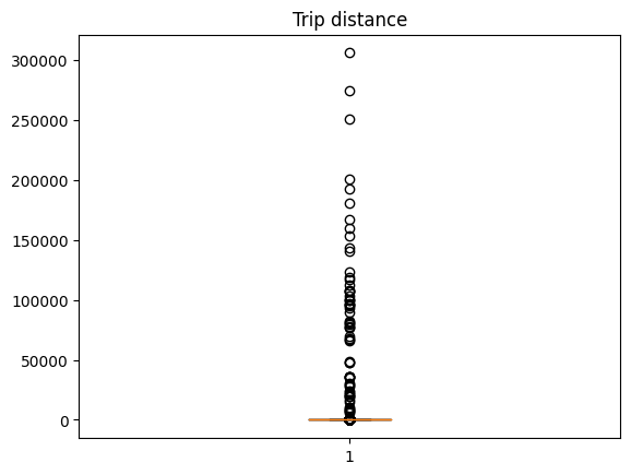
Wow! It looks like some new yorkers really like taxi rides! Let's put the taxi fans aside to improve the visualization and compute the 99th percentile to use it as the cutoff value:
cutoff = df.trip_distance.quantile(q=0.99)
cutoff
19.7
Now, we need to filter out observations larger than the cutoff value; but before we do it, let's create a utility function to capture memory usage:
import psutil

def memory_used():
    """Returns memory used in MB"""
    mem = psutil.Process().memory_full_info().uss / (1024 ** 2)
    print(f"Memory used: {mem:.0f} MB")

memory_used()
Memory used: 941 MB
Let's now filter out the observations:
df_ = df[df.trip_distance < cutoff]
Plot the histogram:
plt.boxplot(df_.trip_distance)
_ = plt.title("Trip distance (top 1% observations removed)")
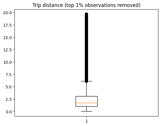
We now see more reasonable numbers with the top 1% outliers removed. There are a few trips over 10 miles (perhaps some uptown new yorkers going to Brooklyn for some delicious pizza?)
How much memory are we using now?
memory_used()
Memory used: 1321 MB
380 MB more! Loading a 36 MB Parquet file turned into >700 MB in memory after loading and applying one preprocessing step!
So, in reality, when we use pandas, what fits in memory is much smaller than we think, and even with a laptop equipped with 16 GB of RAM, we'll be extremely limited in terms of what size of a dataset we process. Of course, we could save a lot of memory by exclusively loading the column we plotted and deleting unneeded data copies; however, let's face it, this never happens in practice. When exploring data, we rarely know ahead of time which columns we'll need; furthermore, our time is better spent analyzing and visualizing the data than manually deleting data copies.
When facing this challenge, we might consider using a distributed framework; however, this adds so much complexity to the process, and it only partially solves the problem since we'd need to write code to compute the statistics in a distributed fashion. Alternatively, we might consider getting a larger machine, a relatively straightforward (but expensive!) approach if we can access cloud resources. However, this still requires us to move our data, set up a new environment, etc. Fortunately for us, there's DuckDB!
DuckDB: A Highly Scalable Backend for Statistical Visualizations
When using functions such as hist (histogram) or boxplot, matplotlib performs two steps:
- Compute summary statistics
- Plot data
For example, boxplot calls another function called boxplot_stats that returns the statistics required to draw the plot. To create a boxplot, we need several summary statistics, such as the 25th percentile, 50th percentile, and 75th percentile. The following diagram shows a boxplot along with the labels for each part:
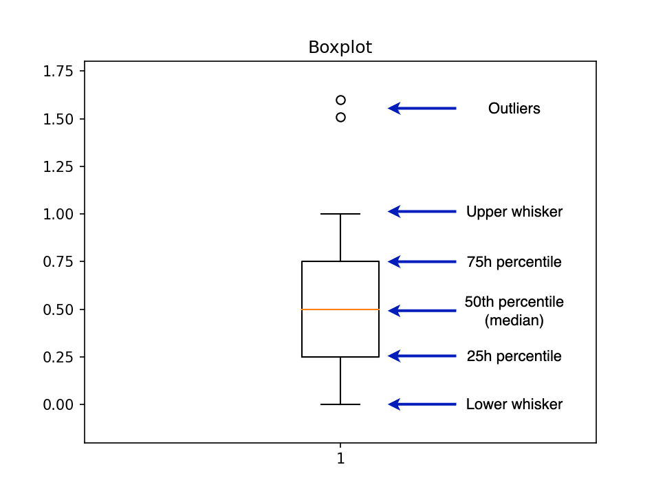
The bottleneck in the pandas + matplotlib approach is the boxplot_stats function since it requires a numpy.array or pandas.Series as an input, forcing us to load all our data into memory. However, we can implement a new version of boxplot_stats that pushes the data aggregation step to another analytical engine.
We chose DuckDB because it's extremely powerful and easy to use. There is no need to spin up a server or manage complex configurations: install it with pip install, point it to your data files, and that's it; you can start aggregating millions and millions of data points in no time!
You can see the full implementation here; essentially, we translated matplotlib's boxplot_stats from Python into SQL. For example, the following query will compute the three percentiles we need: 25th, 50th (median), and 75th:
%load_ext sql
%sql duckdb://
%%sql
-- We calculate the percentiles all at once and
-- then convert from list format into separate columns
-- (Improving performance by reducing duplicate work)
WITH stats AS (
  SELECT
    percentile_disc([0.25, 0.50, 0.75]) WITHIN GROUP
      (ORDER BY "trip_distance") AS percentiles
  FROM 'yellow_tripdata_2022-01.parquet'
)
SELECT
  percentiles[1] AS q1,
  percentiles[2] AS median,
  percentiles[3] AS q3
FROM stats;
| q1 | median | q3 |
|---|---|---|
| 1.04 | 1.74 | 3.13 |
Once we compute all the statistics, we call the bxp function, which draws the boxplot from the input statistics.
This process is already implemented in JupySQL, and you can create a boxplot with the %sqlplot boxplot command. Let's see how. But first, let's check how much memory we're using, so we can compare it to the pandas version:
memory_used()
Memory used: 1351 MB
Let's create the boxplot:
%sqlplot boxplot --table yellow_tripdata_2022-01.parquet --column trip_distance
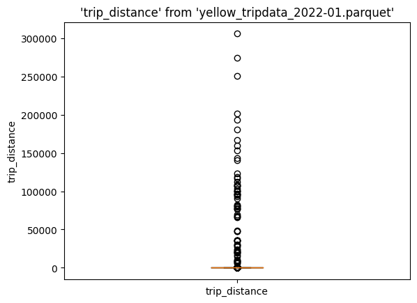
Again, we see all these outliers. Let's compute the cutoff value:
%%sql
SELECT percentile_disc(0.99) WITHIN GROUP (ORDER BY trip_distance)
FROM 'yellow_tripdata_2022-01.parquet'
| quantile_disc(0.99 ORDER BY trip_distance) |
|---|
| 19.7 |
Let's define a query that filters out the top 1% of observations. The --save option allows us to store this SQL expression and we choose not to execute it.
%%sql --save no-outliers --no-execute
SELECT *
FROM 'yellow_tripdata_2022-01.parquet'
WHERE trip_distance < 19.7;
We can now use no-outliers in our %sqlplot boxplot command:
%sqlplot boxplot --table no-outliers --column trip_distance --with no-outliers
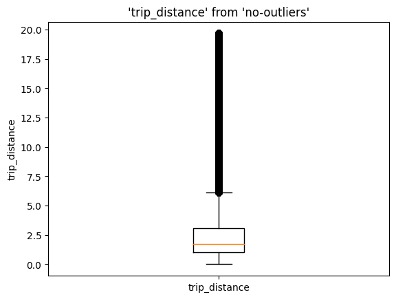
memory_used()
Memory used: 1375 MB
Memory usage remained pretty much the same (23 MB difference, mostly due to the newly imported modules). Since we're relying on DuckDB for the data aggregation step, the SQL engine takes care of loading, aggregating, and freeing up memory as soon as we're done; this is much more efficient than loading all our data at the same time and keeping unwanted data copies!
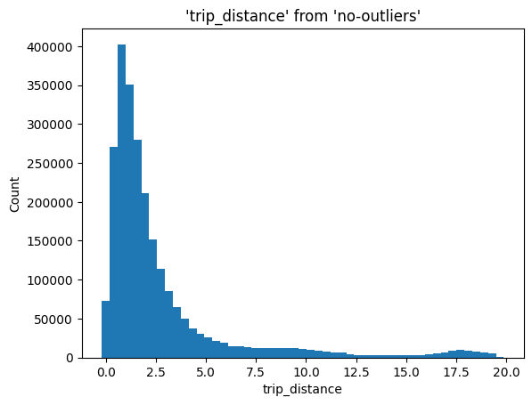
Using DuckDB to Compute Histogram Statistics
We can extend our recipe to other statistical visualizations, such as histograms.
A histogram allows us to visualize the distribution of a dataset, enabling us to find patterns such as modality, outliers, range of values, etc. Like with the boxplot, when using pandas + matplotlib, creating a histogram involves loading all our data at once into memory; then, matplotlib aggregates and plots it.
In our case, we'll push the aggregation to DuckDB, which will compute the bin positions (X-axis) and heights (Y-axis), then we'll pass this to maptlotlib's bar function to create the histogram.
The implementation involves two steps.
First, given the number of bins chosen by the user (N_BINS), we compute the BIN_SIZE:
%%sql
SELECT (max(trip_distance) - min(trip_distance)) / N_BINS
FROM 'yellow_tripdata_2022-01.parquet';
Then, using the BIN_SIZE, we find the number of observations that fall into each bin:
%%sql
SELECT
    floor("trip_distance" / BIN_SIZE) * BIN_SIZE,
    count(*) AS count
FROM 'yellow_tripdata_2022-01.parquet'
GROUP BY 1
ORDER BY 1;
The intuition for the second query is as follows: given that we have N_BINS, the floor("trip_distance" / BIN_SIZE) portion will assign each observation to their corresponding bin (1, 2, …, N_BINS), then, we multiply by the bin size to get the value in the X axis, while the count represents the value in the Y axis. Once we have that, we call the bar plotting function.
All these steps are implemented in the %sqplot histogram command:
%sqlplot histogram --table no-outliers --column trip_distance --with no-outliers
Final Thoughts
This blog post demonstrated a powerful approach for plotting large datasets powered using JupySQL and DuckDB. If you need to visualize large datasets, DuckDB offers unmatched simplicity and flexibility!
At Ploomber, we're working on building a full-fledged SQL client for Jupyter! Exciting features like automated dataset profiling, autocompletion, and more are coming! So keep an eye on updates! If there are features you think we should add to offer the best SQL experience in Jupyter, please open an issue!
JupySQL is an actively maintained fork of ipython-sql, and it keeps full compatibility with it. If you want to learn more, check out the GitHub repository and the documentation.
Try It Out
To try it yourself, check out this collab notebook, or here's a snippet you can paste into Jupyter:
from urllib.request import urlretrieve

urlretrieve("https://d37ci6vzurychx.cloudfront.net/trip-data/yellow_tripdata_2022-01.parquet",
            "yellow_tripdata_2022-01.parquet")

%pip install jupysql duckdb-engine --quiet
%load_ext sql
%sql duckdb://
%sqlplot boxplot --table yellow_tripdata_2022-01.parquet --column trip_distance
Note: the commands that begin with % or %% will only work on Jupyter/IPython. If you want to try this in a regular Python session, check out the Python API.

